
CloudBees DevOptics value streams
In the summer of 2017, I began working with the DevOptics team at CloudBees to refine the visual design and user experience of value streams.
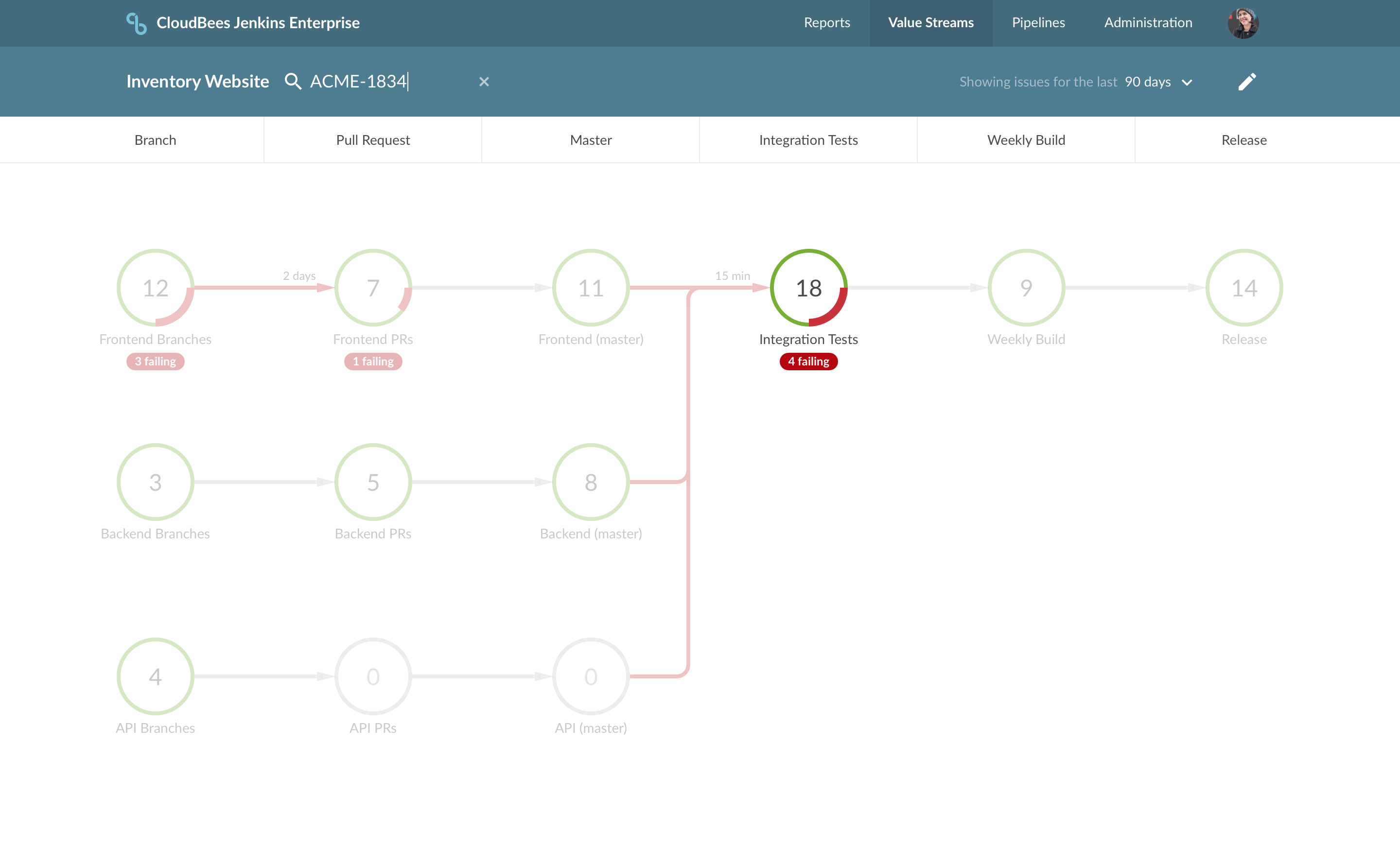
In DevOps terminology, a value stream is a way of mapping the value traveling through product development process to customers, from idea to working software. For large software projects made up of many modules and/or services a value stream can be very complex. Mapping your software value stream can make it easier to highlight bottlenecks in process or methodology.
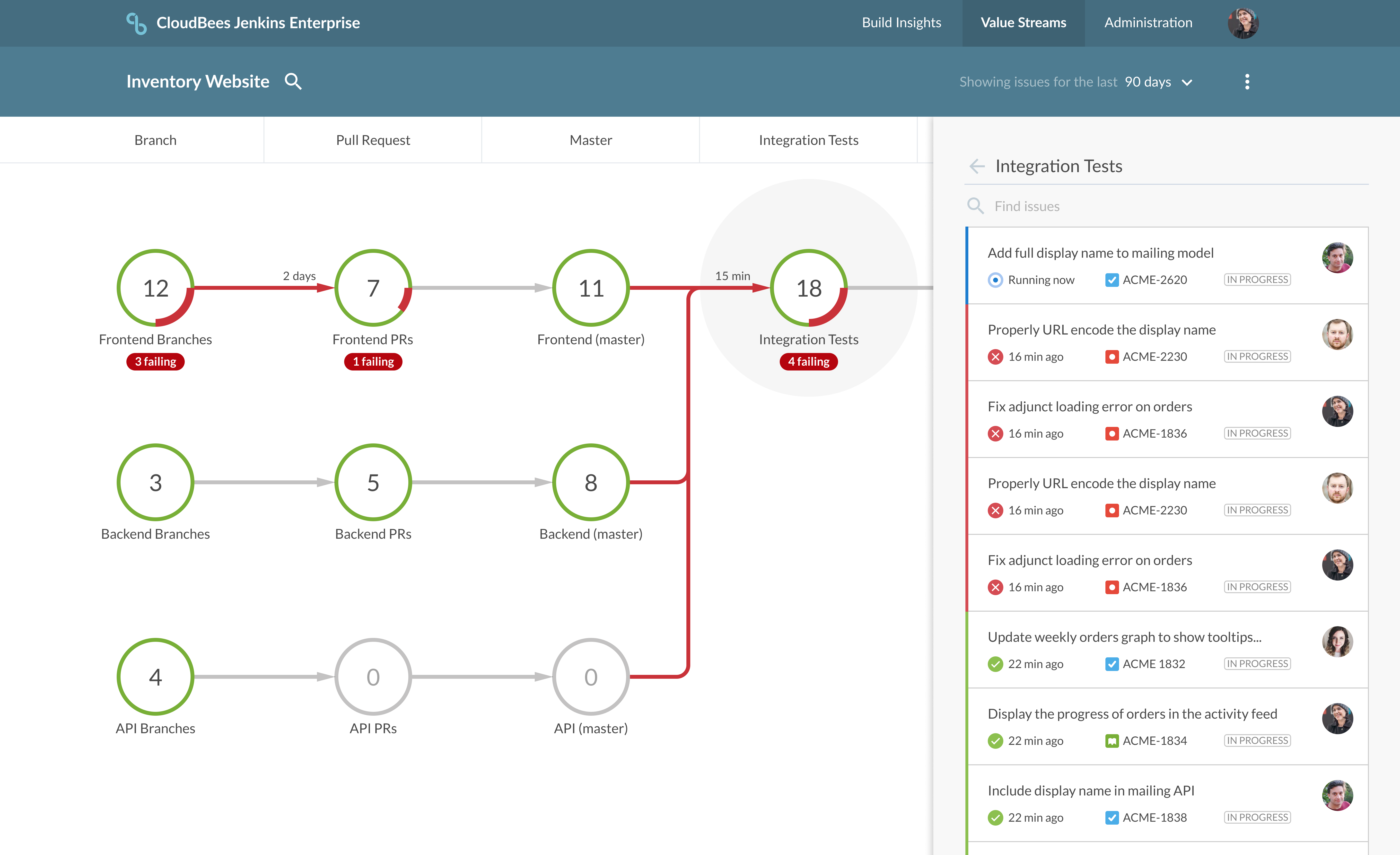
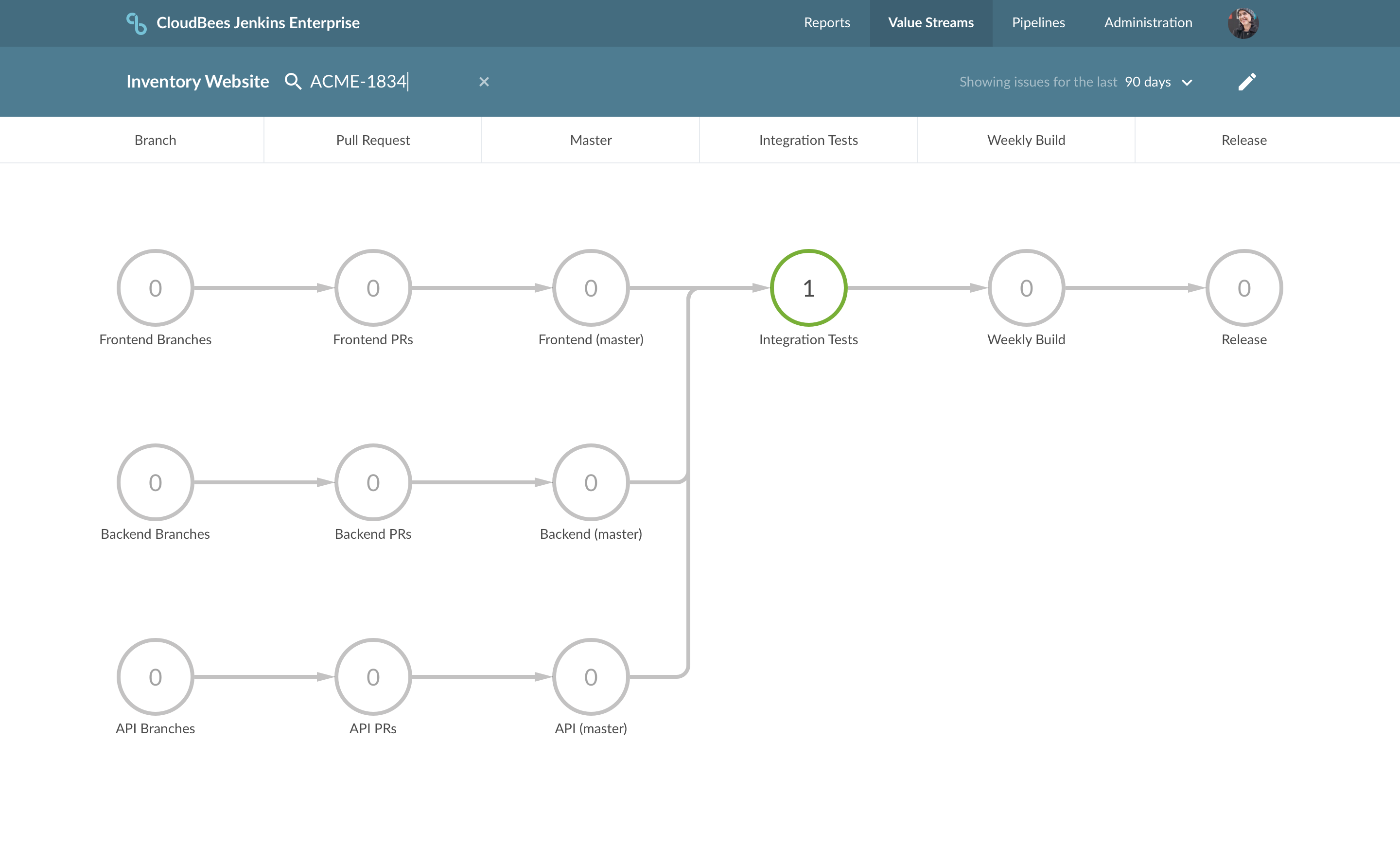
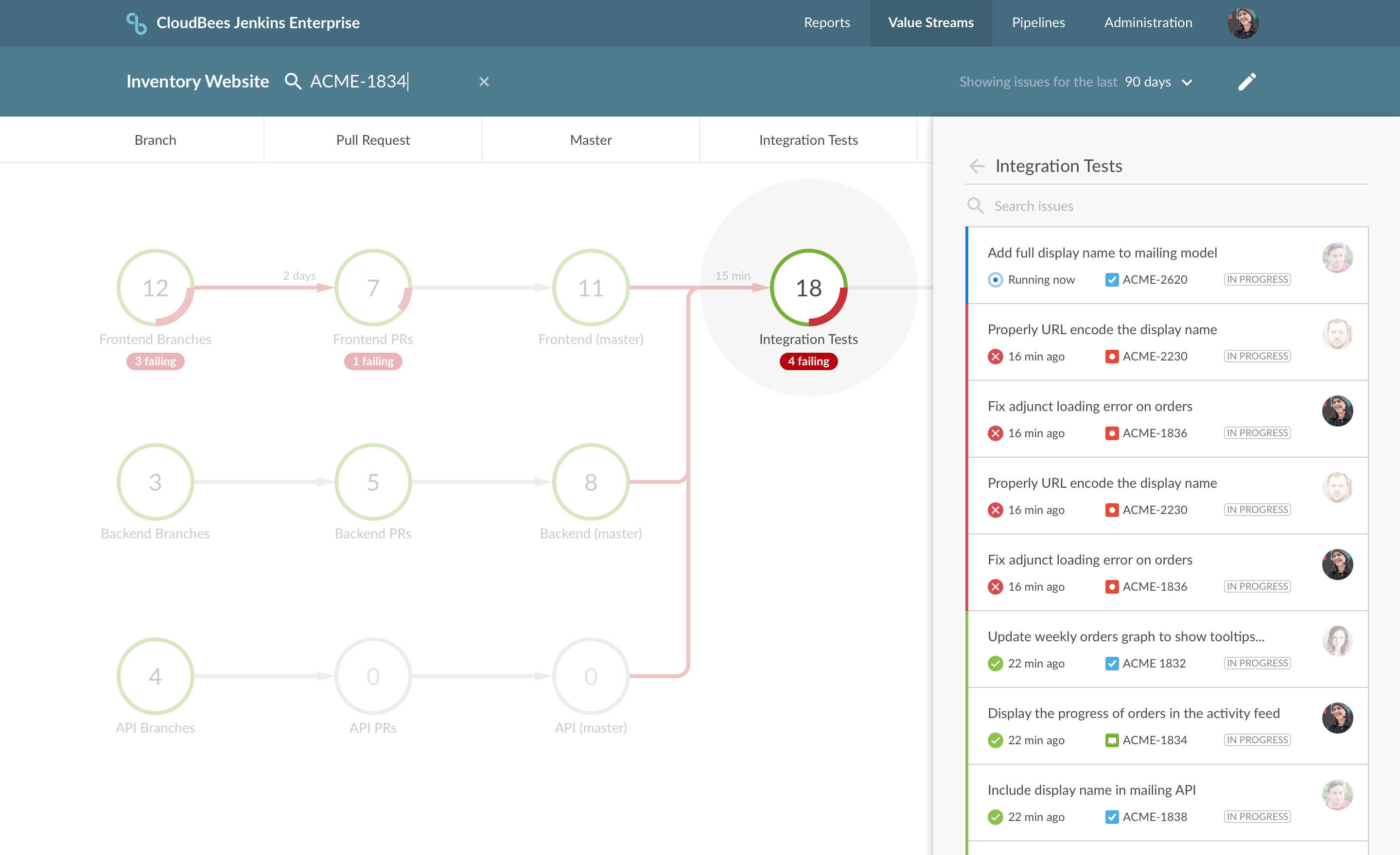
DevOptics has created an automated value stream that shows work traveling though your processes in real-time. It collects data from Jenkins, GitHub, and Jira to visualize each layer of your software development process.
Gate design
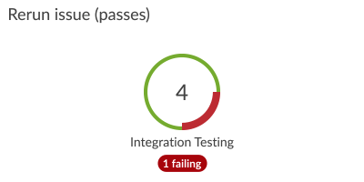
One of my first projects on DevOptics was to refine the look and feel of the gates. A previous designer had created a square gate design with each build represented as a pass or fail symbol. While this design worked it wasn’t the easiest to comprehend. At a glance we wanted it to be easy to see how much work was in each gate and to get a feel for how what percentage of issues where passing or failing.
Starting with the square gate design I created a huge comparison table with various states listed by row and different options shown in the columns. (Two rows from this table are shown below, but there were many more.) This allowed me to compare the options to see which served our use cases the best.
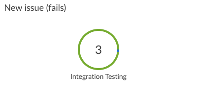
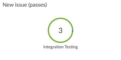
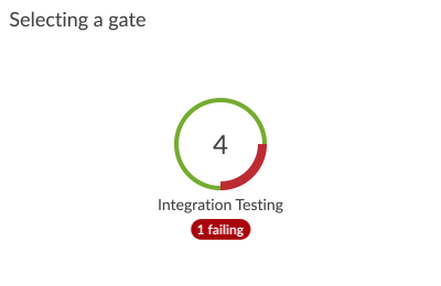
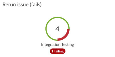
Eventually, I settled on the circular donut graph design shown in the second to last column. However, after a design critique with internal stakeholders, a colorblind employee pointed out that the circular design was difficult to read because the green and red are very similar to a colorblind user. So I took another pass at the design and thickened the red fail line which made it easy to see from the profile of the graph which issues were passing and failing.
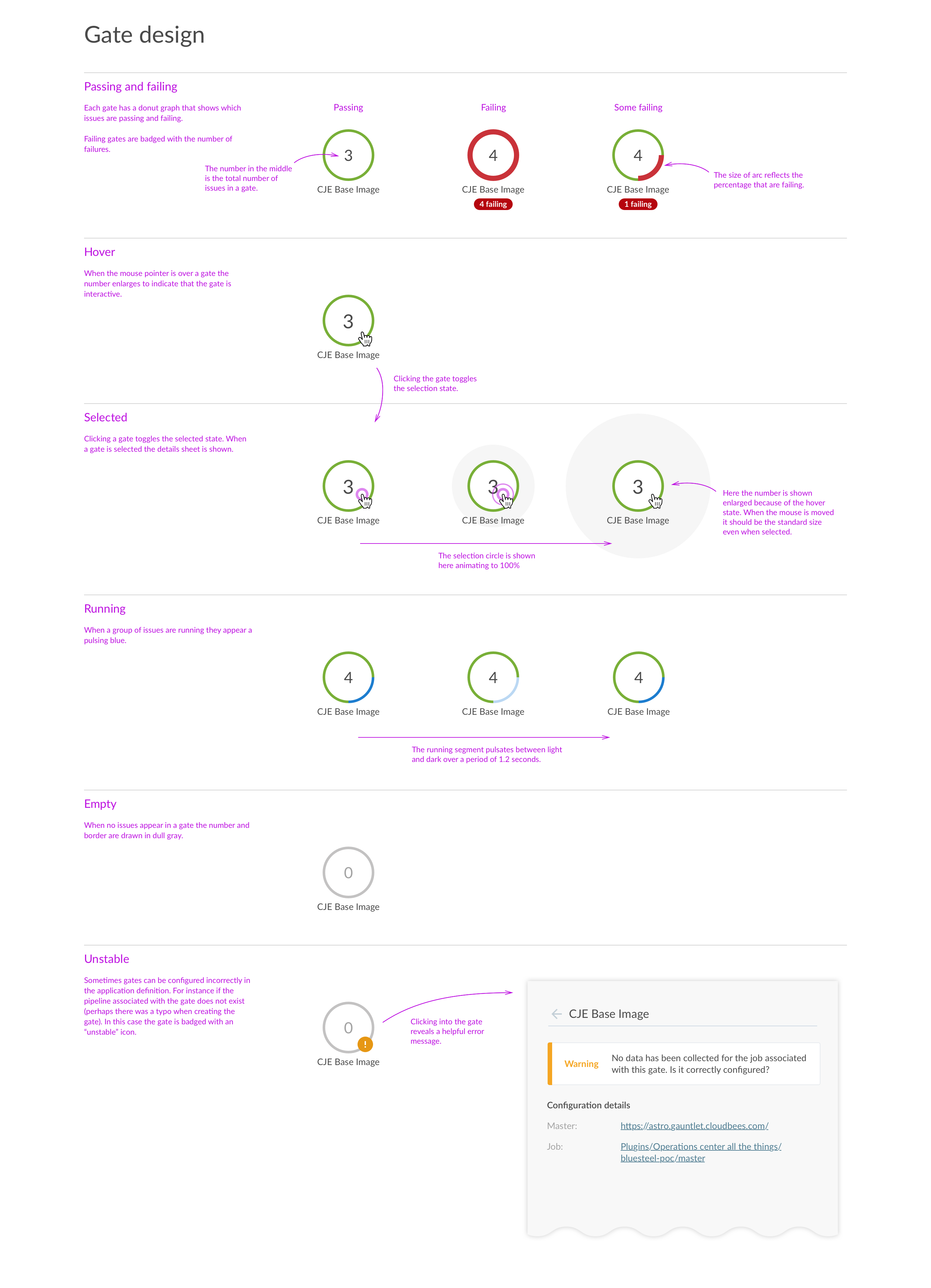
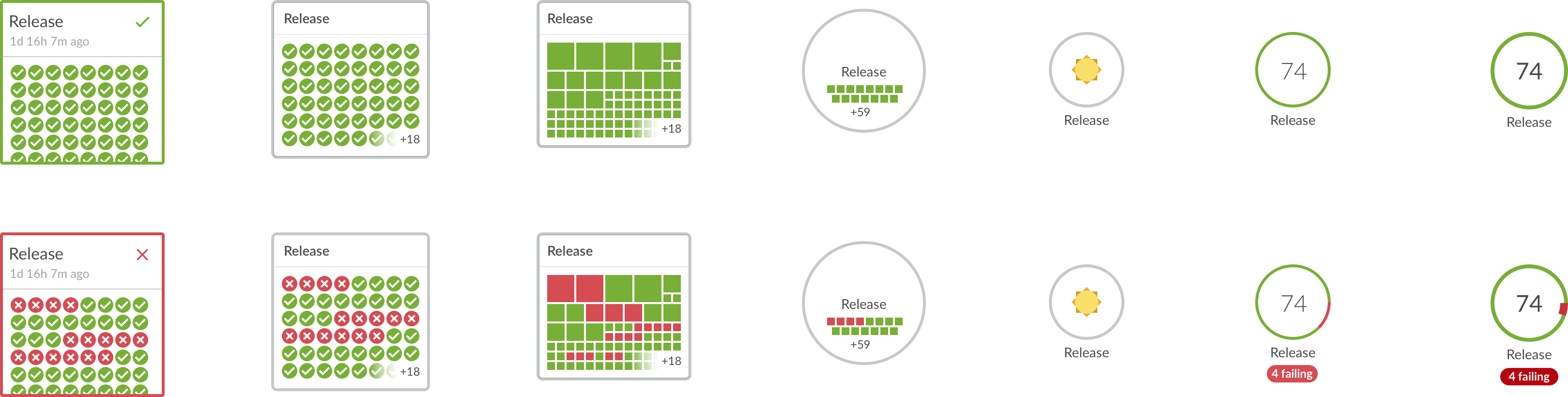
I explored several variations in a multitude of states before settling on the circular design for gates. (Click image to view full table.)
Gate animations
We used animation to make it clear that the value stream graph was interactive and that the data was being streamed in real time.
When you first load the page all of the gates are animated with a loading animation. Running issues are represented in flashing blue and faded to green or red based on whether they pass or fail. When you hovered over a gate the number grows large to indicate that you can click on the gate. And when you click the selection is animated in with a satisfying pop.
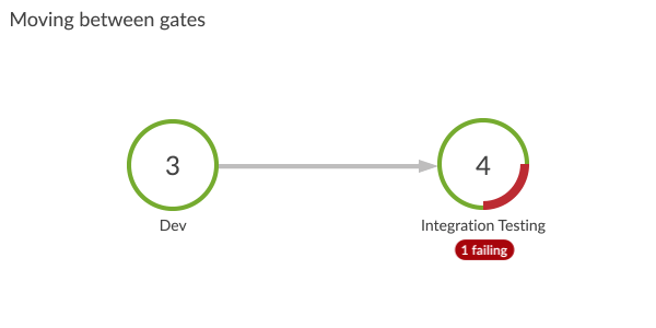
One of the animations that we did not implement because it was judged to be too costly was the work “moving between gates.” However, it was a great exploration.
I prototyped each animation in Adobe After Effects, before it was implemented by the development team.

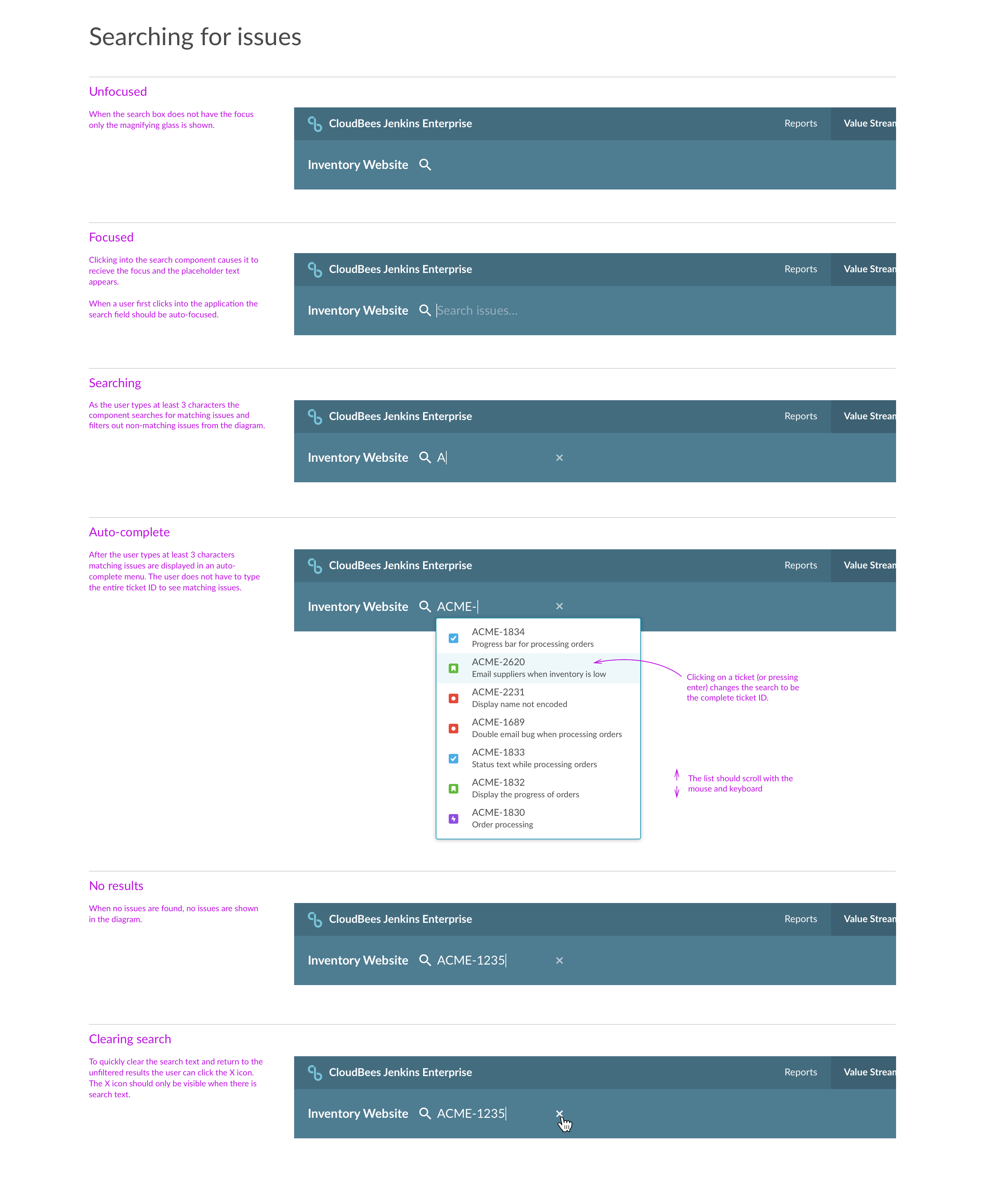
Searching value streams
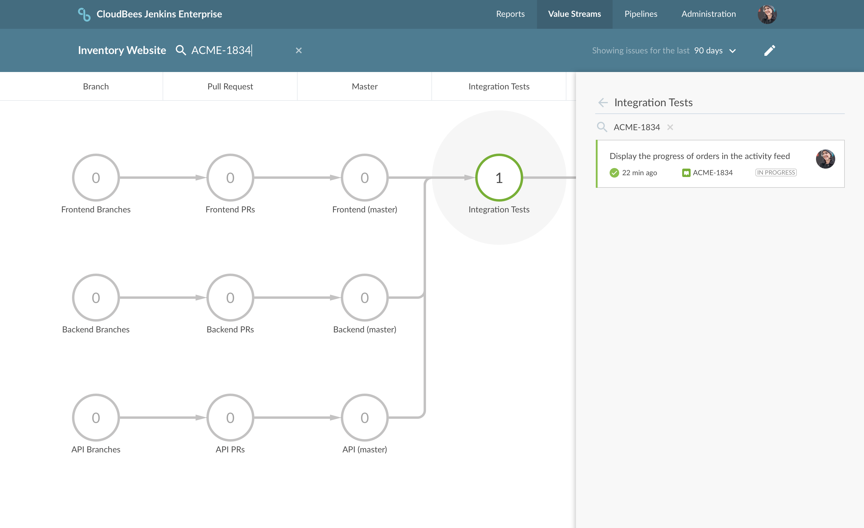
One of the primary use cases for a value stream is to find where work is in the system. DevOptics is integrated with JIRA and shows the count of issues in each gate in the donut graph. But the gate must be selected in order to see the specific issues (not just the count). In order to make it easy to find specific issues we added a search box with auto complete on the issue ID. I explored two approaches to highlighting the search . In the first, when a user entered text in the search box the entire graph was filtered changing the count shown in each gate to reflect the number of issues matching the search. In the second the graph remained the same, but gates without matching issues were faded so that it was easy to spot gates with matches.
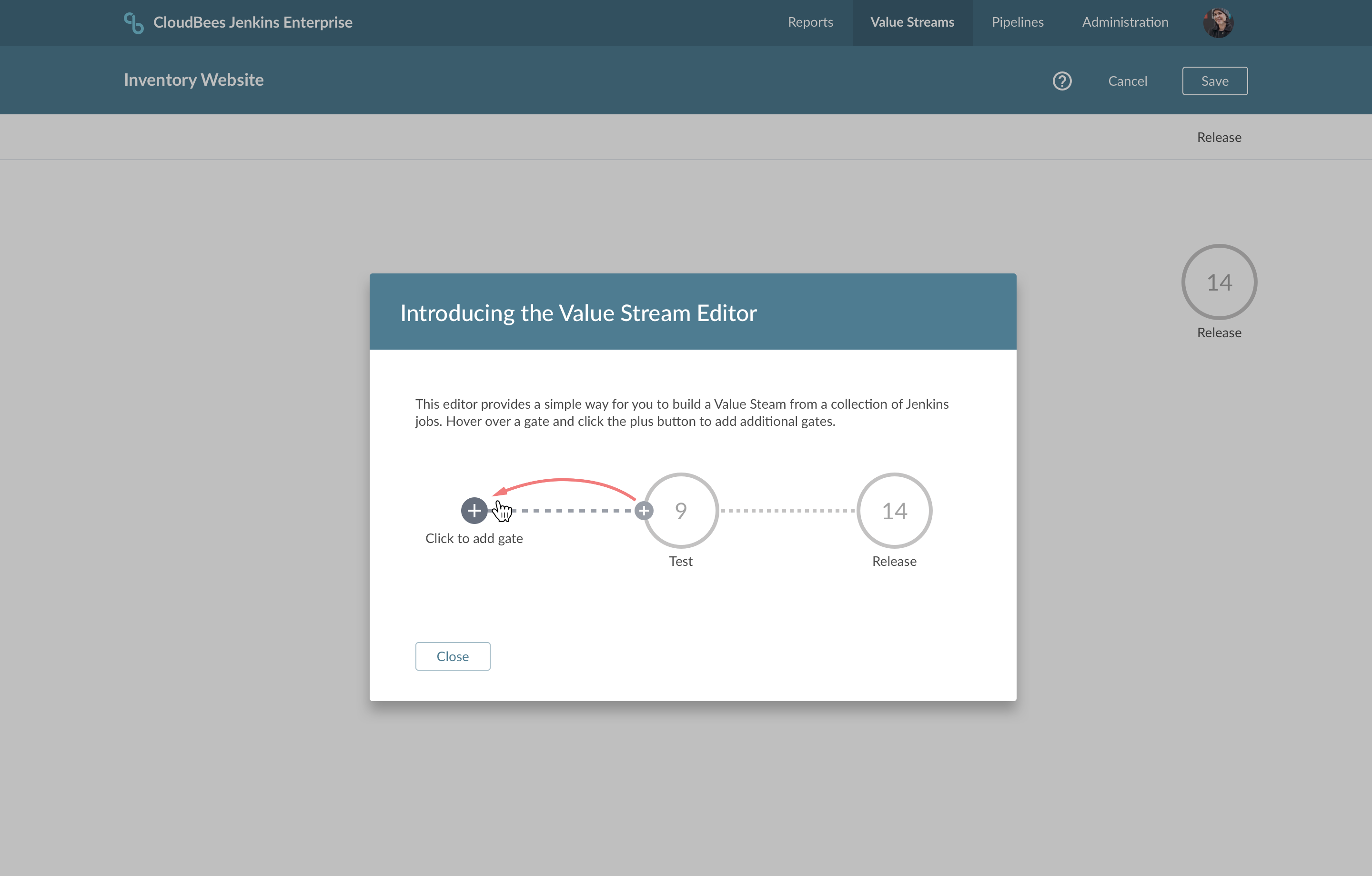
Value Stream Editing
Originally, creating a value stream involved writing a definition in JSON format (which was complex). We wanted to make it easy for people getting started with the product so we began exploring what it would take to add a visual editor. After a hack day or two on it we determined that a visual editor would not be as costly as initially anticipated. With a small investment we had our first iteration on it. I worked very closely with our frontend developer to prototype and implement the concepts.
Error states
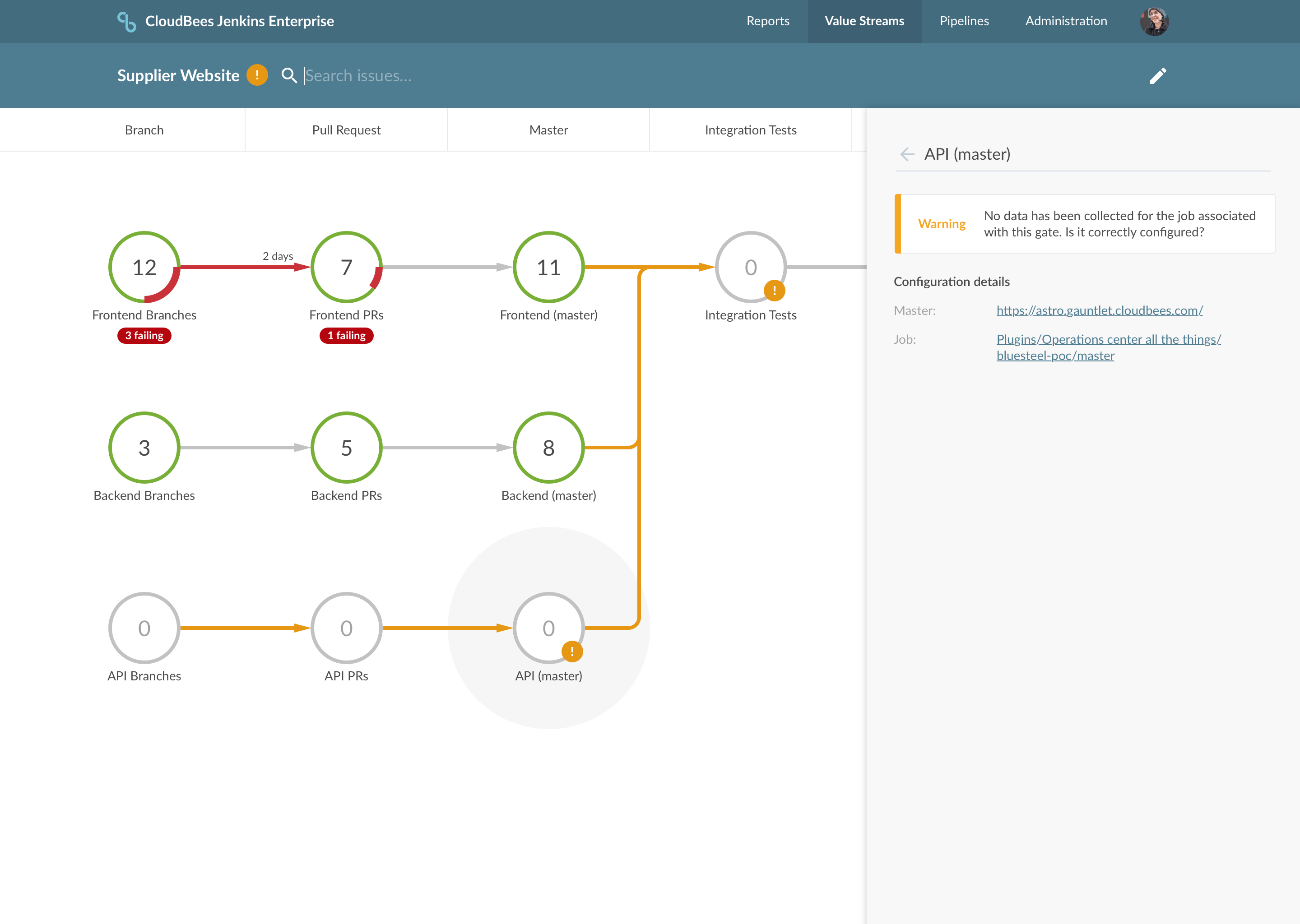
Because of the technical nature of the product there are many error states that can occur for various reasons. I worked with the engineering team to triage the errors and determine the best approach in the UI. We made some changes to the UX to avoid certain errors in the first place and for the unavoidable errors I designed ways to display and highlight those errors in the UI.
While I was only with the DevOptics team for a period of about 6 months, it was thrilling to work with them to refine the visual language of this new product. I’m quite proud of the work we did under tight deadlines and the way that we pulled together as a team to produce a beautiful user experience.
“John joined the DevOptics team in 2017 and was a tremendous help in revamping the UX around Value Streams. Value streams as a concept is something fairly new in the DevOps world. For the product to be successful, it is critical that users understand what they are looking at as well as the value they get out of it. John took a fresh look at the whole experience and did a complete revamp of the UX, making the product much more intuitive and appealing in the process.”
—Karan Malhi, Director of Product Management, CloudBees DevOptics