
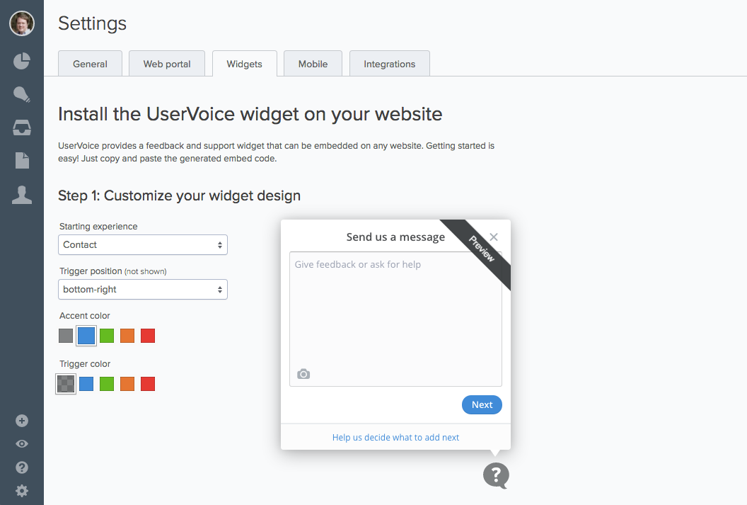
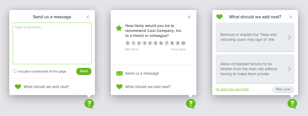
UserVoice widget
In the Fall of 2013, I began working with UserVoice to redesign their widget. The widget is a key part of their strategy to help other companies collect feedback and offer support on products through the web. UserVoice helped popularized the “Feedback” tab which appears even to this day on many websites. Redesigning the widget was a chance to reimagine the way feedback is given on the web.
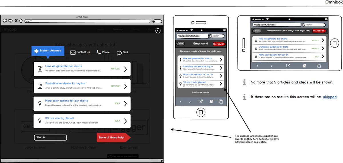
As we began the project, the mobile-first trend was becoming a big deal. UserVoice needed a widget that gave mobile a first-class experience. The current widget had not been designed with mobile in mind and, though quite functional, it was beginning to look a little dated. It needed a redesign.
I took the lead on the designing the new widget and worked closely with UserVoice’s Head of UX on the flows and general user experience.
“John’s greatest asset is his versatility. He not only rocks the house at UX design but he’s also enough of an engineer himself to know how to design something that won’t take forever to build. He’s great at systems thinking (thinking beyond a single page or workflow) and his visual design chops are not too shabby either. In short, he’s the jack of all trades / master of many that everyone wishes they could have on their team.”
—Richard White, CEO, UserVoice.com
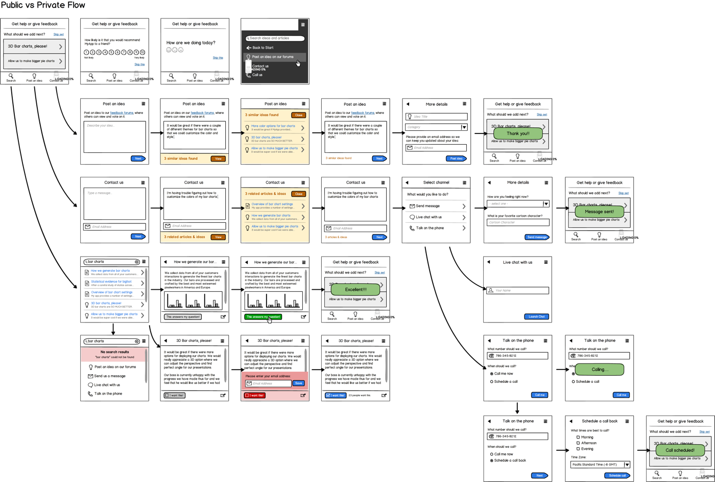
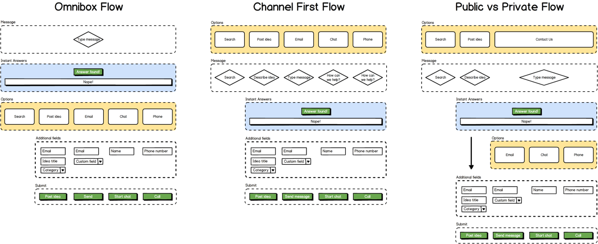
Early mockups and prototypes
I began with a series of mockups focused on the mobile experience and used those to establish consensus in the company for what we wanted to build.
Early on we experimented with a responsive layout for the widget but soon abandoned that approach in favor of a widget with a small footprint that worked equally well on mobile and desktop.
Once we had achieved consensus on what we wanted to build, I then constructed a working HTML prototype of the widget, which we later brought to life as the fully functioning widget.
The widget was built with Backbone. I wrote all of the HTML, CSS, and a large portion of the JavaScript.
Visual design
Our goal for the visual design was to find something minimal that could be customized to easily blend with the site on which it was embedded.
Early prototypes used a much heavier look and feel that was modeled on the current look of the UserVoice admin console, but we quickly iterated away from that and towards a flatter look with a customizable accent color.
I also designed a series of custom icons, which were used throughout the project and also in the UserVoice Mobile SDKs for iOS and Android.
The UserVoice widget was one of my early projects at UserVoice and continues to be one of my favorites. It showcases the full range of my UX, visual design, and frontend programming skills. The simplicity of the final design is something that I am very proud of and hope will stand the test of time.